
Page 19 - index
P. 19
TOP COVER 524+0)
2(1# 0'95
THE BRAND
POLICE 94+66'0 $; -'44; 9*+56.'%41(6
%4'#6+8' 9'..
Evolution is the name of the game. It’s kept the human race moving forward and it can
keep an established corporate identity on track. It’s not always a good idea to go all out
*#8' ;17 016+%'& ‘gung ho – get out your Crayola – let’s take it further’ re-brand mad; it’s expensive, time
consuming to implement and can sometimes hint at financial insecurities in a dramatic
9'²8' )16 # 0'9 attempt to attract more business. Evolving a corporate identity is a smart way to make sure
.1)1! *'4'²5 *19 +6 a business is visually current without the same degree of pain of change.
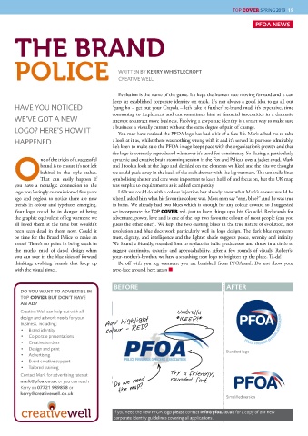
You may have noticed the PFOA logo has had a bit of a face lift. Mark asked me to take
*#22'0'&¦ a look at it as, whilst there was nothing wrong with it and it’s served its purpose admirably,
he’s keen to make sure the PFOA image keeps pace with the organisation’s growth and that
the logo is correctly reproduced whenever it’s used for consistency. So during a particularly
ne of the tricks of a successful dynamic and creative brain storming session in the Fox and Pelican over a jacket spud, Mark
brand is to ensure it’s not left and I took a look at the logo and decided on the elements we liked and the bits we thought
behind in the style stakes. we could pack away in the back of the sock drawer with the leg warmers. T e umbrella lines
OT at can easily happen if symbolising shelter and care were important to keep hold of and focus on, but the UK map
you have a nostalgic connection to the was surplus to requirements as it added complexity.
logo you lovingly commissioned five years I felt we could do with a colour injection but already knew what Mark’s answer would be
ago and neglect to notice there are new when I asked him what his favourite colour was. Most men say “erm, blue?” And he was true
trends in colour and typefaces emerging. to form. We already had two blues which is enough for any colour coward so I suggested
Your logo could be in danger of being we incorporate the TOP COVER red, just to liven things up a bit. Go wild. Red stands for
the graphic equivalent of leg warmers: we adventure, power, love and is one of the top two favourite colours of most people (can you
all loved them at the time but wouldn’t guess the other one?). We kept the two existing blues in the true nature of evolution, not
been seen dead in them now. Could it revolution and blue does work particularly well in logo design. T e dark blue represents
be time for the Brand Police to make an trust, dignity, and intelligence and the lighter shade suggests peace, serenity and infinity.
arrest? T ere’s no point in being stuck in We found a friendly, rounded font to replace its italic predecessor and threw in a circle to
the murky mud of dated design when suggest continuity, security and approachability. After a few rounds of visuals, Robert’s-
you can soar in the blue skies of forward your-mother’s-brother, we have a smashing new logo to brighten up the place. Ta-da!
thinking, evolving brands that keep up Be off with you leg warmers, you are banished from PFOAland. Do not show your
with the visual times. type-face around here again ■
$'(14' #(6'4
&1 ;17 9#06 61 #&8'46+5' +0
TOP COVER $76 &10²6 *#8'
#0 #&!
%TGCVKXG 9GNN ECP JGNR QWV YKVJ CNN Umbrella
FGUKIP CPF CTVYQTM PGGFU HQT [QWT *KEEP!*
DWUKPGUU KPENWFKPI Ad d highlight
$TCPF KFGPVKV[ colour - RED? POLICE FIREARMS OFFICERS ASSOCIATION
%QTRQTCVG RTGUGPVCVKQPU
%TGCVKXG VGPFGTU
&GUKIP CPF RTKPV 5VCPFCTF NQIQ
#FXGTVKUKPI
'XGPV ETGCVKXG UWRRQTV
6CKNQTGF VTCKPKPI
%QPVCEV /CTM HQT CFXGTVKUKPI TCVGU CV T ry a friendly ,
OCTM"RHQC EQ WM QT [QW ECP TGCEJ Do we need rounded font
-GTT[ QP QT the map?
MGTT["ETGCVKXGYGNN EQ WM POLICE FIREARMS OFFICERS ASSOCIATION
5KORNK»GF XGTUKQP
+H [QW PGGF VJG PGY 2(1# NQIQ RNGCUG EQPVCEV KPHQ"RHQC EQ WM HQT C EQR[ QH QWT PGY
EQTRQTCVG KFGPVKV[ IWKFGNKPGU EQXGTKPI CNN CRRNKECVKQPU